Twelve Thousand Stitches: What a Left-Chest Logo Is Made Of
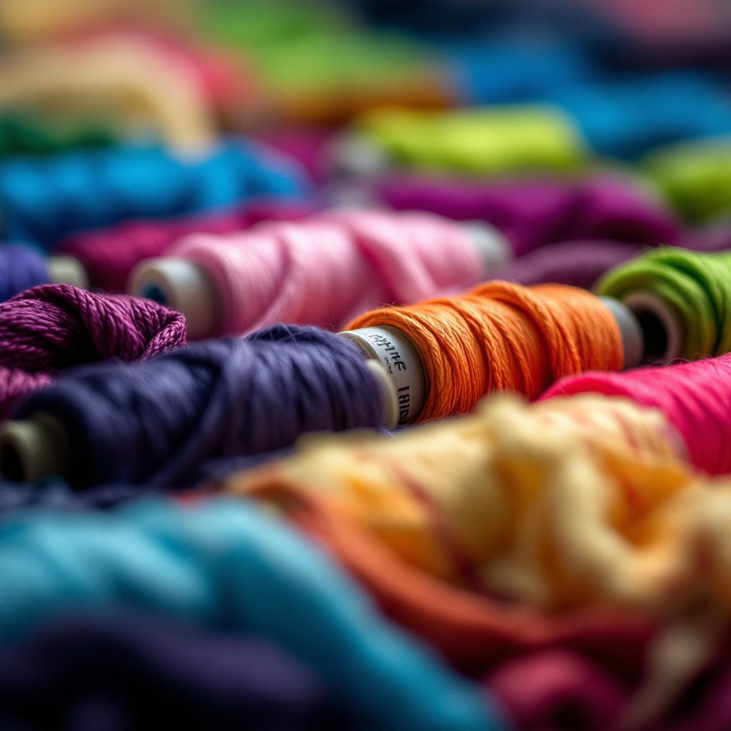
Before any collection ships, Faraz puts a loupe on the first sample and counts stitches. On a left-chest mark that's 5,000 to 12,000 needle penetrations in a space the size of a business card, and every one of them was planned before the machine started. The order they go down in decides whether the mark lies flat for years or puckers by the third wash. This post follows a logo from the file you send us to the finished polo.
How a logo gets digitized
A vector file is a set of shapes, and an embroidery machine can only follow paths. In digitizing, a designer rebuilds the logo as a sequence of stitches. Every element needs a decision about which stitch type it gets, in what direction, at what density and in what order. Two digitizers given the same logo produce two different files, and one of them looks better on fabric. Because of that, we redraw every logo for thread instead of running the file from your last vendor.
Suhail built the Design Studio after watching designers spend two weeks on that redraw. He wanted software to do the first 80% in four minutes so a designer can spend the day on the last 20. The stitch decisions live in that last 20. What comes out is a stitch file with a count. We look at the count before anything else, because it predicts how the garment will feel under the mark.
Underlay is the layer you never see
Before a visible stitch goes down, the machine lays underlay, a light grid of stitches beneath the design. It holds the fabric still while the top stitches pull on it, and it gives the satin something to sit up on. Stable fabric needs very little. Fleece needs enough to keep the mark from sinking in and losing its shape.
Thin underlay is the commonest shortcut in cheap embroidery. It doesn't show in a sample photo, and you only feel it once the garment has been through a few washes.
Satin stitch versus fill stitch
Almost every mark is built from two stitch types.
- Satin stitch runs side to side across a narrow shape such as a letter or an outline. It gives embroidery its raised, glossy look, because the thread lies in long parallel floats that catch light. Past a certain width the floats get long enough to snag, and wide shapes switch to fill.
- Fill stitch tiles a large area with rows of shorter stitches, like woodgrain. It sits flatter and holds up better over area, and its direction can vary to give a shape texture.
A typical left-chest logo is fill for the shape and satin for the outline and wordmark. The cap is the exception. Its structured crown lets us run foam under the satin for a raised letterform, and that's the 3D option caps have and shirts don't.
Density changes with the fabric.
The same stitch file can't run on every product. Density, meaning how close the stitches sit, is tuned to what's underneath.
- Piqué (the polo, 200 GSM) is a textured knit with visible cells. With too little density the texture shows through the fill, and with too much the polo puckers around the mark. We run fuller underlay and moderate density, and we hoop the tailored front so the placket stays straight.
- Fleece (the hoodie, 330 GSM) is thick and lofty, and stitches sink into it. We use heavier underlay to hold the nap down and a touch more density so small details don't vanish into the brushed surface.
- Twill (the cap) is dense and stable. Cap embroidery photographs well because twill takes the least underlay and the crispest satin.
- Oxford (the shirt, 140 GSM) is light and flat. Density comes down so the mark doesn't stiffen a fabric meant to drape.
A sample set matters more for embroidery than for print, because a mark that's right on twill can be wrong on fleece.
Why 5 mm is the floor for lettering
Thread has a physical width, and a satin-stitched letter needs two or three passes to read as a stroke. Below 5 mm cap height the counter of an "e" closes and a tagline becomes a fuzzy bar. When a lockup includes small text, the digitizer either enlarges the whole mark or drops the tagline from the thread version, and we'll show you which we chose. A tagline that has to stay tiny is a reason to print that piece instead.
Thread colors, matched on fabric
We stitch up to 12 thread colors per mark. We match brand colors from the thread chart against your Pantone reference, and we check the match on the actual fabric rather than a screen. A cobalt that's right on white piqué reads darker on navy fleece, because the ground shows between stitches. For a tonal mark the thread sits a step or two from the garment color, close enough to disappear at a distance and far enough to catch light up close. Halcyon Hotels' cream-on-sage staff collection took a physical sample to get right.
The sample locks the file.
For embroidery the sample is the test. You can order a paid sample set ahead of the bulk run, which adds about two weeks. We stitch the mark on the actual product in the actual color. Look at it from across the room and then from six inches, and wash it once. If the letters are crisp and the fabric around the mark lies flat after the wash, the digitizing is locked. Every reorder runs the same stitch file, and the hoodie a new hire gets in year two matches the one their manager got at launch.
Embroidery built this way is permanent, and the mark outlives the garment. The Design Studio shows placement and method for each piece on the collection preview, and the decoration methods guide has the full comparison with print.